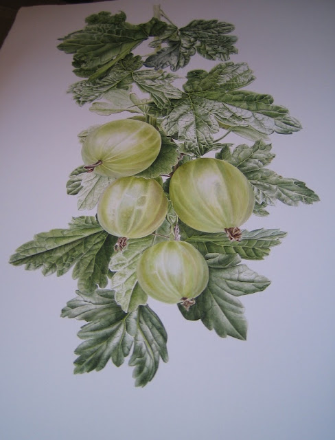
So another piece complete in the space of a month. Can't quite believe it myself, but there you go. It appears that practice makes you faster as well as better. I am currently sat in my old bedroom surrounded by my old books and toys, perched on a stool next to a print of Brenda the Broadbean. She's upside down and wedged in with all the RHS prints and Gary the Gooseberry. He's at the back, I am hiding him from view and have stuffed him in a plastic wallet for protection in this very dusty room. I am hiding him as I need a visual break. I can't see the wood for the trees and need to take a couple of days out away from him in order to see all the obvious mistakes. I have covered my palette up and am now on 'pause'. Making it a good time for an online virtual update.
 |
| Gooseberry (Ribes uva-crispa) J R Shepherd © |
Here he is... he is a proud chappy. To begin with he was painted to the Irrepressibles 'The Opening' on loop - such a beautiful song which just flows and is therefore very good for primary washes. Then his tastes moved onto The Hurts 'Wonderful Life' on loop... and for the finale, he decided he rather liked VNV Nation (especially the Eurythmics mash-up). I often finish a painting to heavy electronica as I need to enter a space that is beyond me and things start to go dark.
 |
| Gooseberry (Ribes uva-crispa) J R Shepherd © |
Whilst loosing myself to VNV I got a little Facebook message from fellow illustrator, and very good friend, Shevaun. It was about greens... She had been in conversation with Sue Wickison about Maimeri Blu Viridian... Long story, but it moved onto the world of Inky Leaf green and the desire to know how it is made.
Haha! *Introducing smug smile* This is a tricky one to answer as I don't do swatches, so I can't show you any. I personally don't like them because:
A) I cannot make them look nice and organised and this infuriates me
B) Colour mixing can become too analytical and for me painting is always intuitive
C) The colours I get are from layering. For me to make the swatches I'd get from my painting technique would take a very long time indeed. Time I don't have, or wish to use, on such a venture.
 |
| Gooseberry (Ribes uva-crispa) J R Shepherd © |
So, this is tricky as I cant post anything on here to show you. There is my palette... I often post pictures of my palettes, and then there is the process which you see regularly. I am very honoured that some of you feel that my greens are good. To receive such praise is really lovely and very encouraging. I suppose my greens are intense, in that they are 'rich' and 'deep'. This is because a painting, such as my Gooseberries, has about 10-30 layers of watercolour on it depending on the zone you're looking at. I start to regularly burnish the paint towards the end - when I get to about 10 layers - to try and prevent them from coming off of the paper as I add more layers. This often makes the paint 'glow' and makes the specimen 'come to life'. Arthur Harry Church burnished his works - check it out. I also do it because my Saunders Waterford paper is slightly textured despite being hot press.
So for me, greens are achieved by not just by careful mixing but through time and layering whilst also understanding the nature of the plant, its physiology and structure. I always think about the chromatic strips when I start a plant. When I have a proper studio I'd like to get a chromatograph done of every plant before I start because I feel that if I were to analyse anything, that would be the thing to look at.
 |
| A chromatograph of a red maple - these are the things I think about when mixing green. |
Green Mixes...
I always have a very limited palette for every painting. I recently indulged myself and bought a load of blues as the Daler Rowney cobalt blue I have been using since dot ran out. I blame Darth Vader for that. I did start to use a bit of French Ultramarine (both DR and W&N) in 2013, but I found myself darting back to cobalt blue as French ultra marine lacks a shade of warmth that I like in my greens. It's too harsh for my liking in a green mix, but then it depends on the leaf... If it is a kale or something lurid, or a reflection, I will go for a dash of Phatalo or Cerulean. As part of my 'blue purchase order' I have just started trying out DR Manganese Blue and I prefer this shade thus far.
Yellows
It was always DR Gambodge... but then I invested in some tubes and got W&N Green Gold and Transparent Yellow after someone said it was nice to add on as a last layer to make the leaves 'glow'. Convinced, I tried it. I haven't used my tube of Green Gold since that day in 2013 as didn't like it... Trans Yellow on the other hand - nice, but I tend not to use it as a top layer but in the mix. I also use W&N Aureolin but have noticed you have to be careful with this one as it can precipitate when combined with other pigments, such as Phatalo Blue, which is a right pain. I use Aureolin with Hookers Green/Sap Green/Cobalt Blue.
Just like Marianne North - Rose Madder everytime. I sometimes stray and use Permanent Rose. All leaf greens need red. This is where I think everyone goes wrong. I also use a lot of purple. It used to be DR Mauve but it is very, very opaque and can precipitate, so now I use W&N permanent magenta. These pinks/reds/mauves change in quantitiy depending on the green. Gooseberries have a lot of purple in and not as much blue as a result. Also - shading is mostly done in the opposite colour. I used a lot of Permanent Rose in the Coffee Plant as a result of shading (but also in the leaf). I like the Rose Madder though, as it is much warmer and gives the piece an 'old' quality about it. Permanent Rose has a icy cold nature to it which I don't really like.
I also use a dash of the ready made greens... This started in later 2013 when I started Cos, I always mixed my own before then. What happened is I got lazy and couldn't be bothered mixing all these greens up when I have so much to put on the paper. It's a lot of paint when you are using half pans. It wouldn't be so bad if I were a tube girl, as it comes out wet. So yes, I also use W&N Hookers Green and W&N Sap Green. I used to have some lovely DR Hookers Green. It ran out two years ago and I have only just got to ordering some more in. They have changed it for sure - it isn't right for leaves. It has that lurid nature to it that Viridian can have.
I personally really struggle when I am painting light leaves of a sappy colour, or when the light passes through a leaf giving that intense bright glow that looks slightly un-natural. A bit like the new leaves of a beach tree. I find those greens so very tricky because they really are just a shade of yellow in my eyes and my eyes refuse to deal with yellow. However, when I do have to paint them, these days I use W&N Hooker's Green and Transparent Yellow mixed together. I used to use DR Sap Green, but it is very opaque, and while I don't mind opquae colours, when one is painting something that is translucent (ie - light is shining through said item to produce said effect) then you need a transparent colour.
Highlights
I don't use body colour and I don't use masking fluid, I use use the paper.
 |
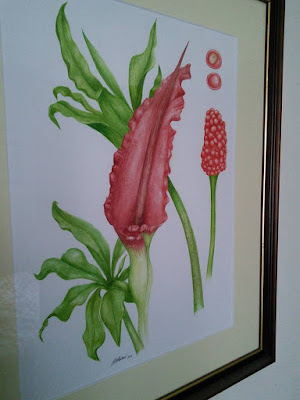
| Dragon Arum (Dracunculus vulgaris) 2005 |
N.b.
Here is a piece I painted for my dad ten years ago. In my mind now I feel that it is not a very good piece of work, but at the time I remember being chuffed to bits with it. Check out those greens! My goodness... no depth, nothing and of course it is all wrong. The leaves are nothing like that of a Dragon Arum, and rather typically, I am too busy focusing on the inflorescence, and ignoring the importance of leaves, but then we all have to start from somewhere. It takes time, I still can't a lot of things right and my greens are not perfect. I am very honoured that some of my readers feel that I am good at green - it's a comforting thought. I can't for the life of me get yellows right, or pinks or whites... But then I haven't practiced these as much and I am not drawn to these shades so that is my problem and it is up to me to sort that out. Anyway - hope this helps a few of you. Please feel free to comment or email if you have any questions...


I think this is your best study to date of everything you have ever painted. Well done Jess.
ReplyDeleteThanks mum. I think I have to be in agreement with you on that one - bar the Pineapple which remains to be the pièce de résistance...!
DeleteBrilliant! Both your gooseberries and your fabulous greens! You are truly the Green Queen and your mixes really work! Thank you!
ReplyDeleteThanks for the comments Shevaun - glad you like the Gooseberries and my greens...
DeletePerfect in every way Jess.
ReplyDeleteGreens like the enternal balance of warm and cool, always test the artist to the limit by asking them to understand the chromatic from the glaucous, and the light from the dark. Your intuitive way of recognising these polarities, brings both form and texture to your lovely work.
Stunning! I am curious about the cromatograph, haven't heard about it before?
ReplyDeleteAmazing Jess
ReplyDeleteThe texture of the leaves, translucence & shine of the fruits make this a staggering piece & I understand your Mum's reaction but I agree, there was also something special about the pineapple. As I now understand your technique of building up the layers, I wish I had the foresight of what can be created in such a way.
When working with your chromatographs have you noticed if a change in solvent affects the pigment range obtained & therefore do you have a preferred solvent particularly ith reference to waxy or hairy cuticles?
Well done again
Thank you for such an informative post- really helpful.
ReplyDelete